CURRENT IDENTITY
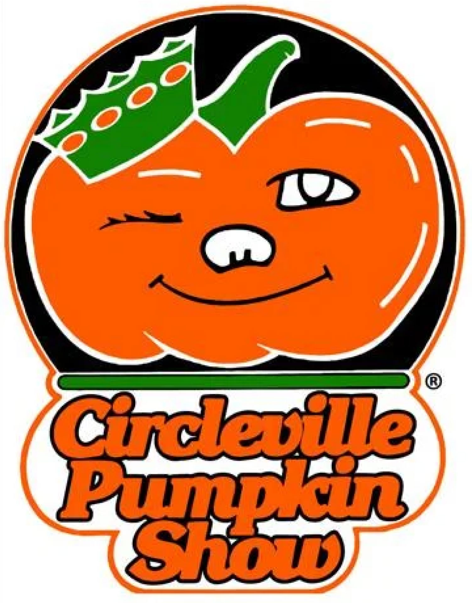
The current visual identity features the mascot Winky the Pumpkin. It is unsuccessful because it is very outdated, and the type is very close together, making it difficult to read.
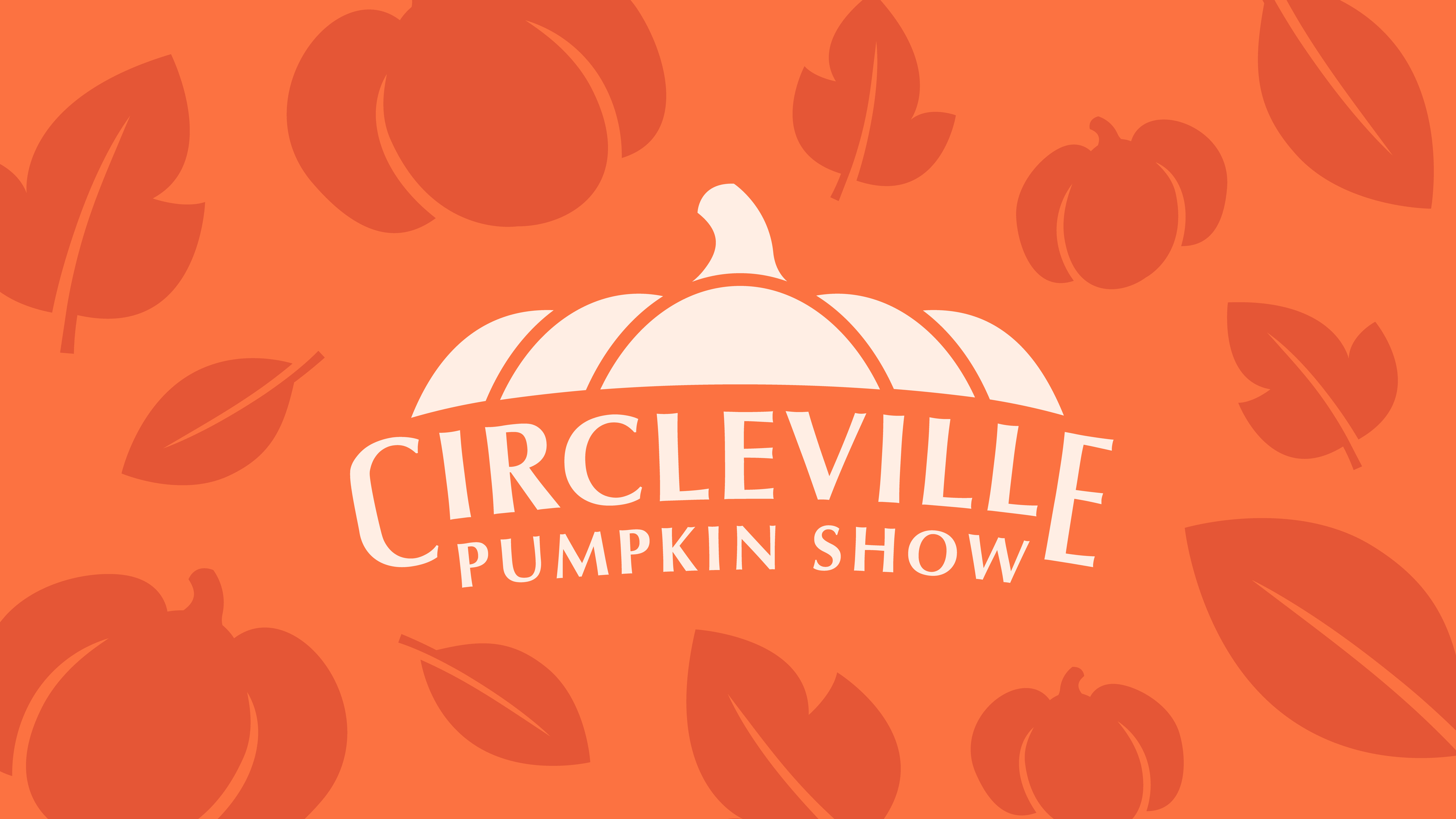
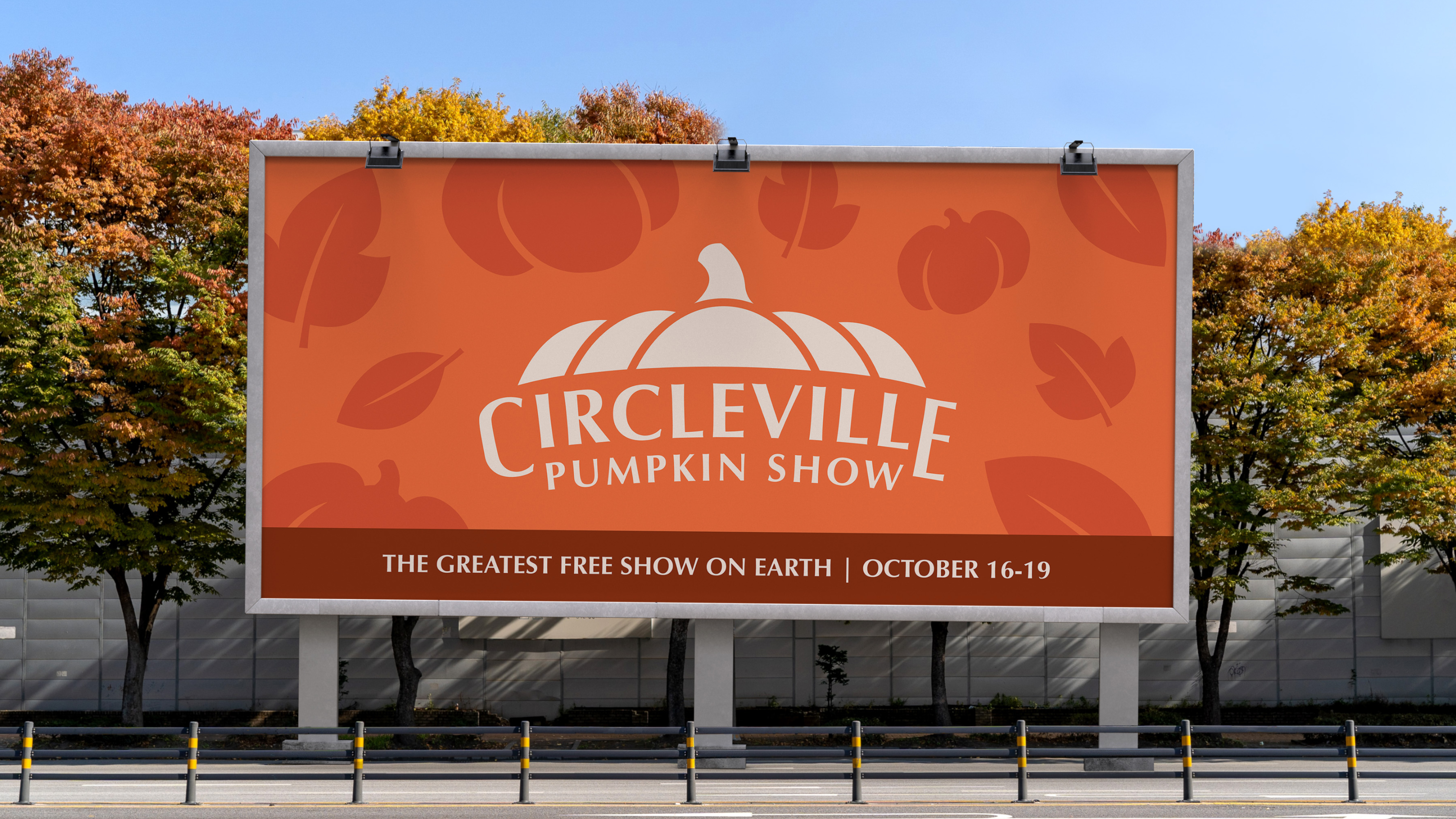
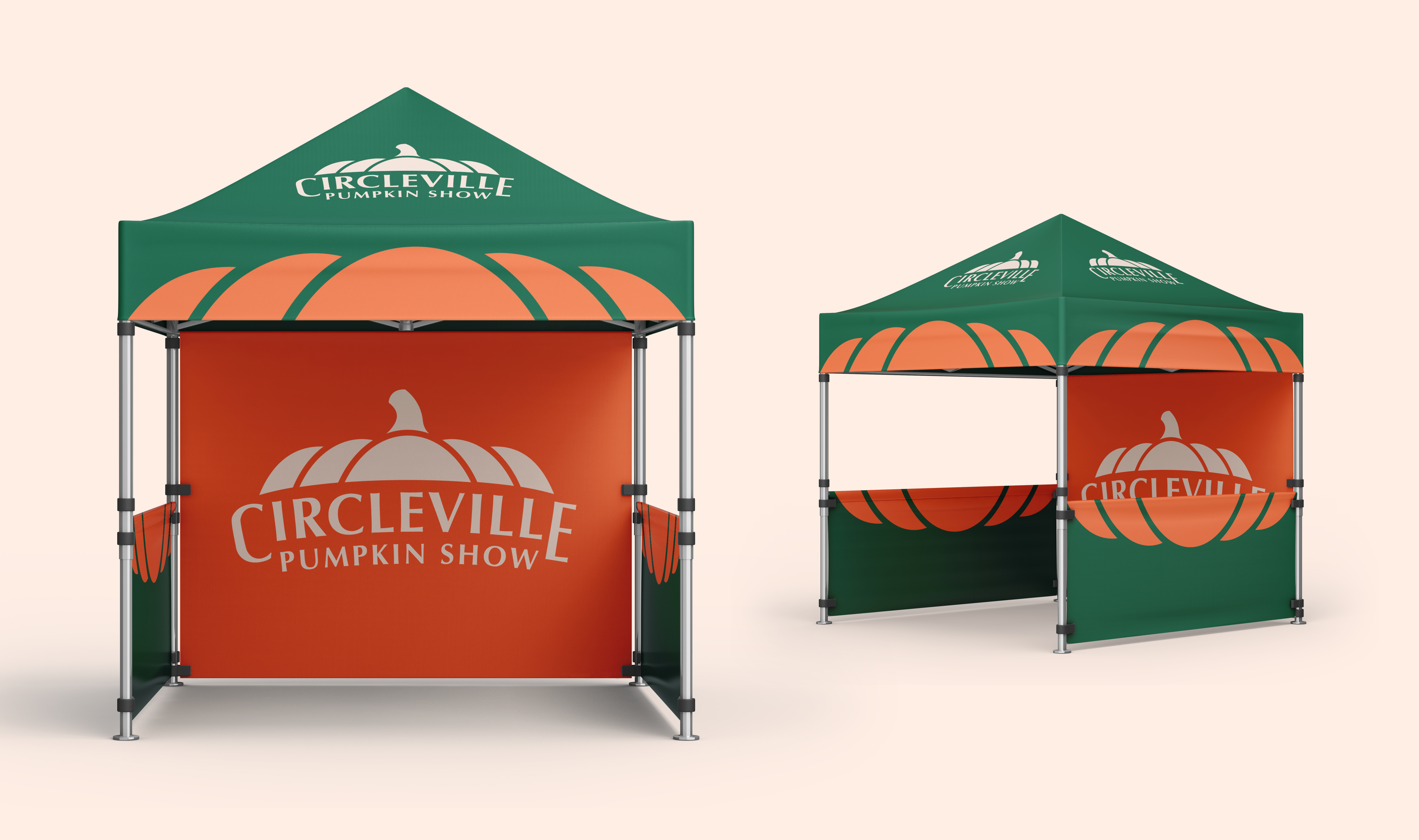
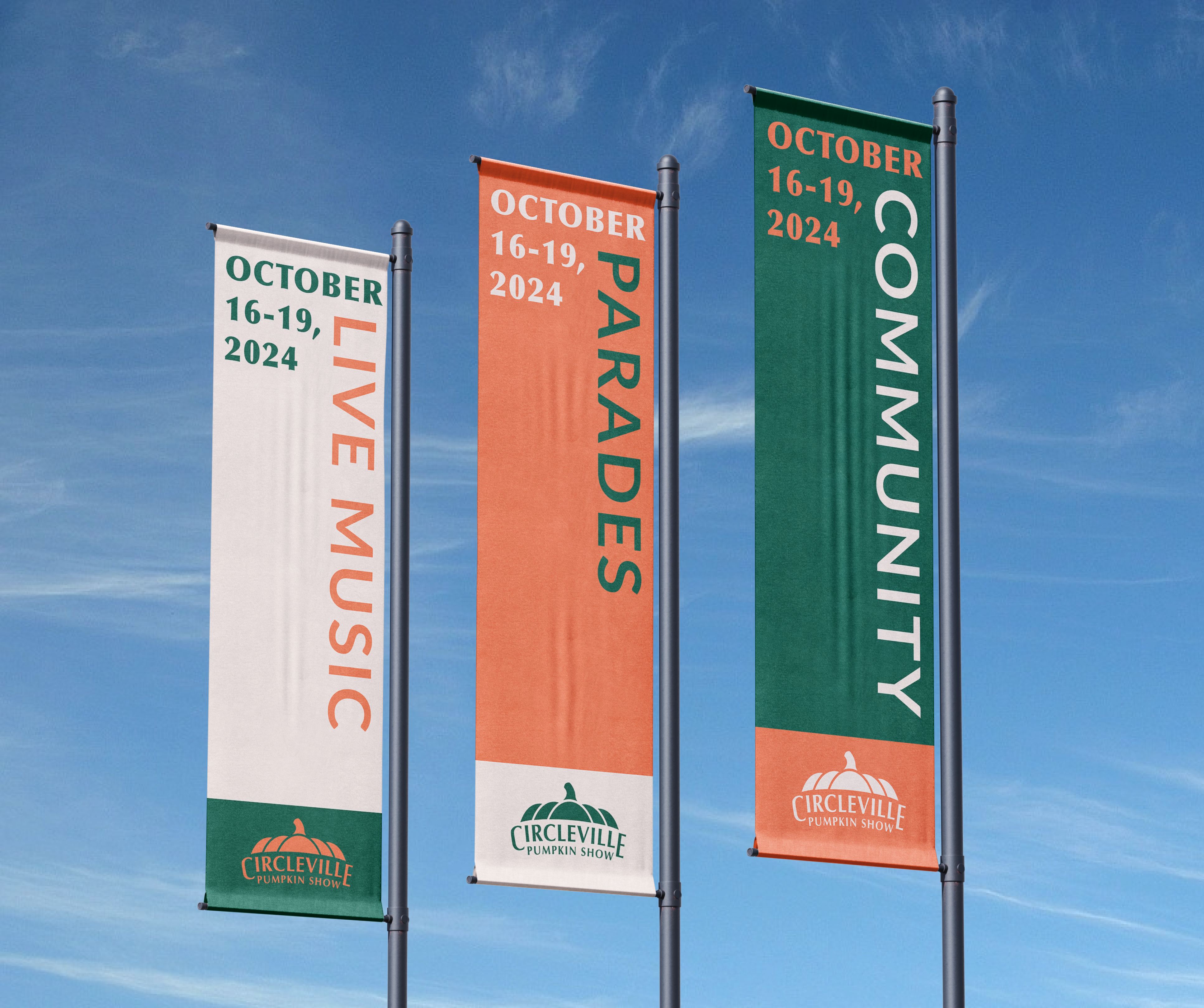
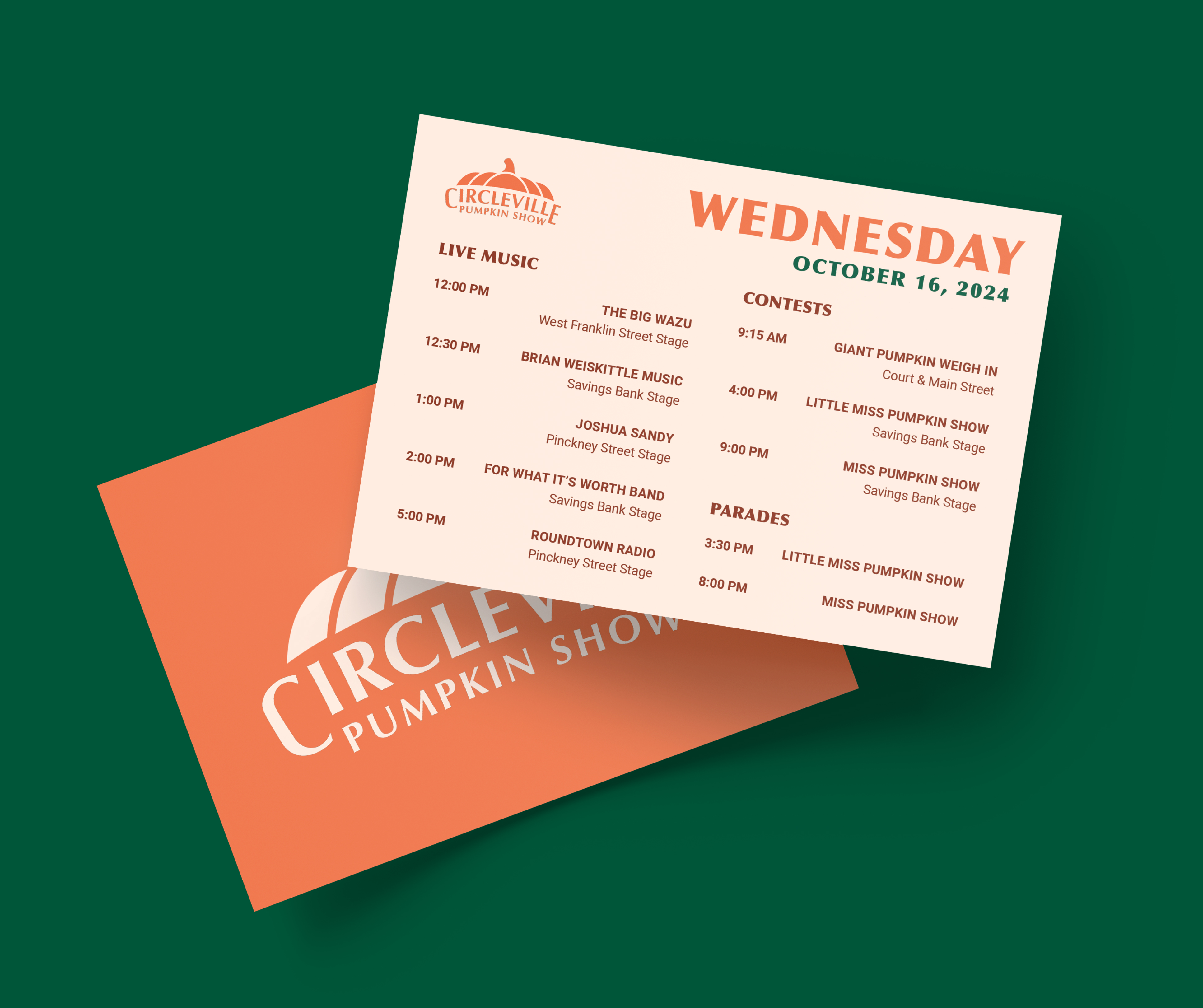
Redesign the visual brand identity of the Circleville Pumpkin Show↗ by developing an original logomark and various festival touchpoints that capture the meaning of the festival.
The current visual identity features the mascot Winky the Pumpkin. It is unsuccessful because it is very outdated, and the type is very close together, making it difficult to read.
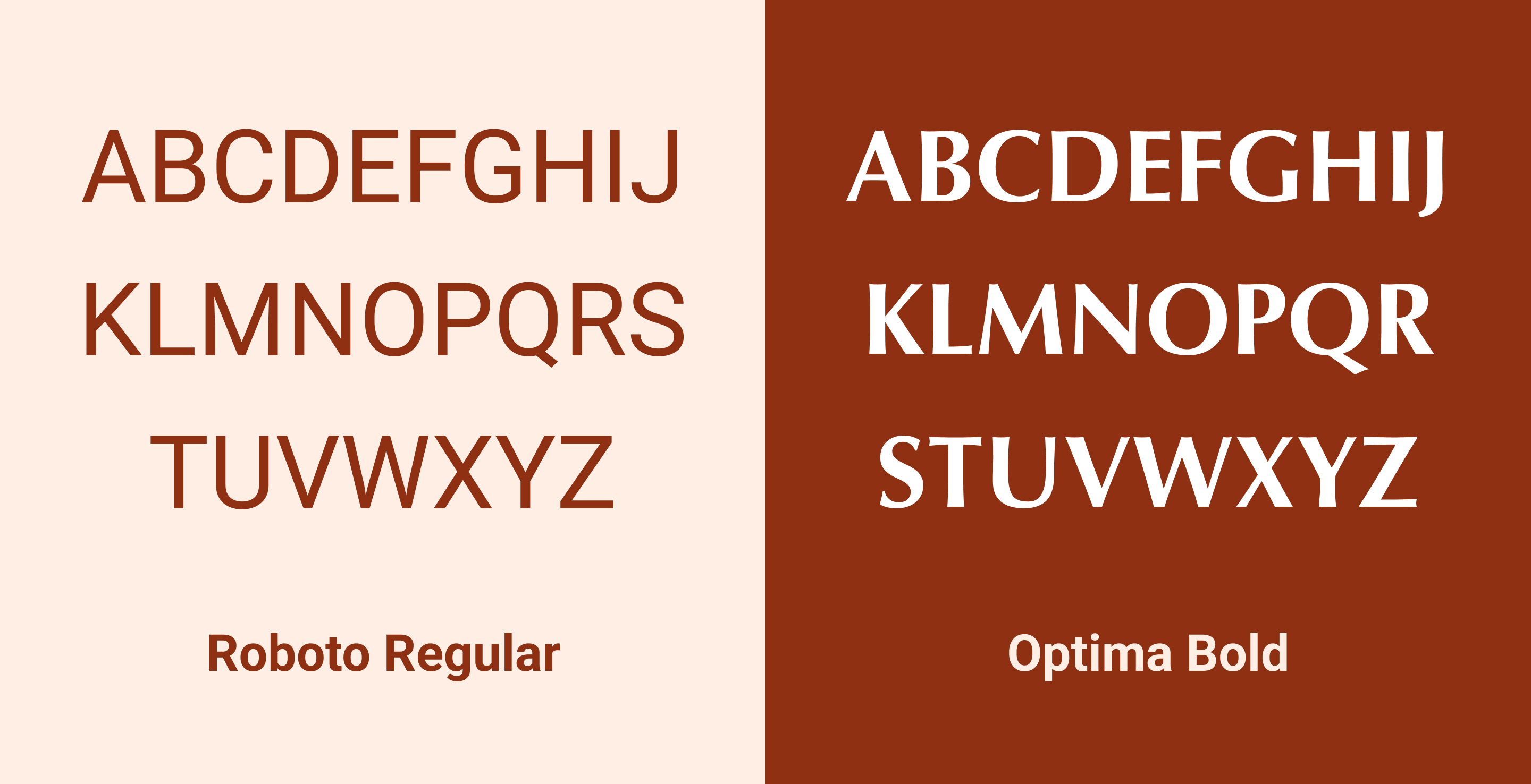
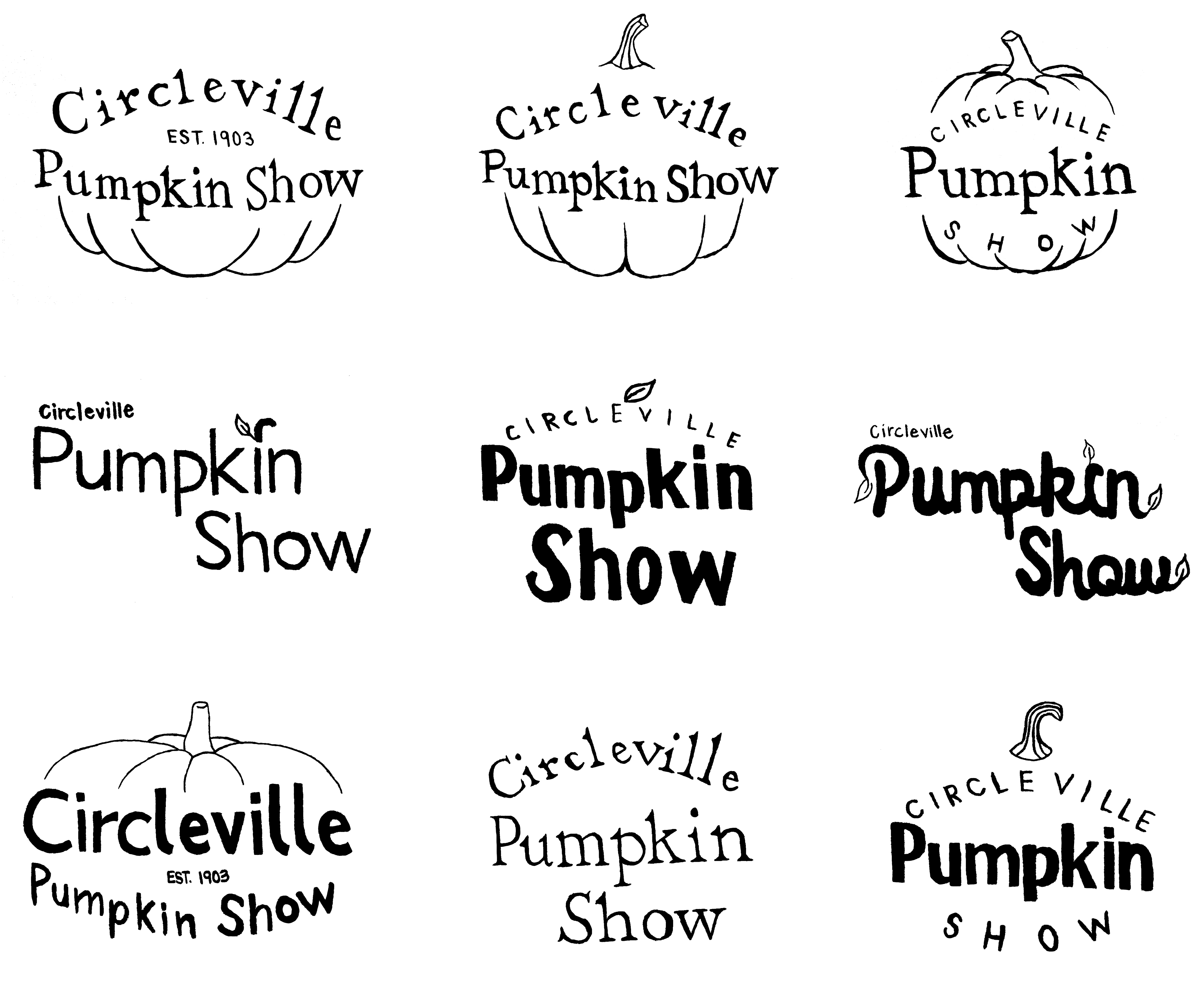
I tried different Old Style typefaces to play into the history behind the festival, while still trying to modernize it.
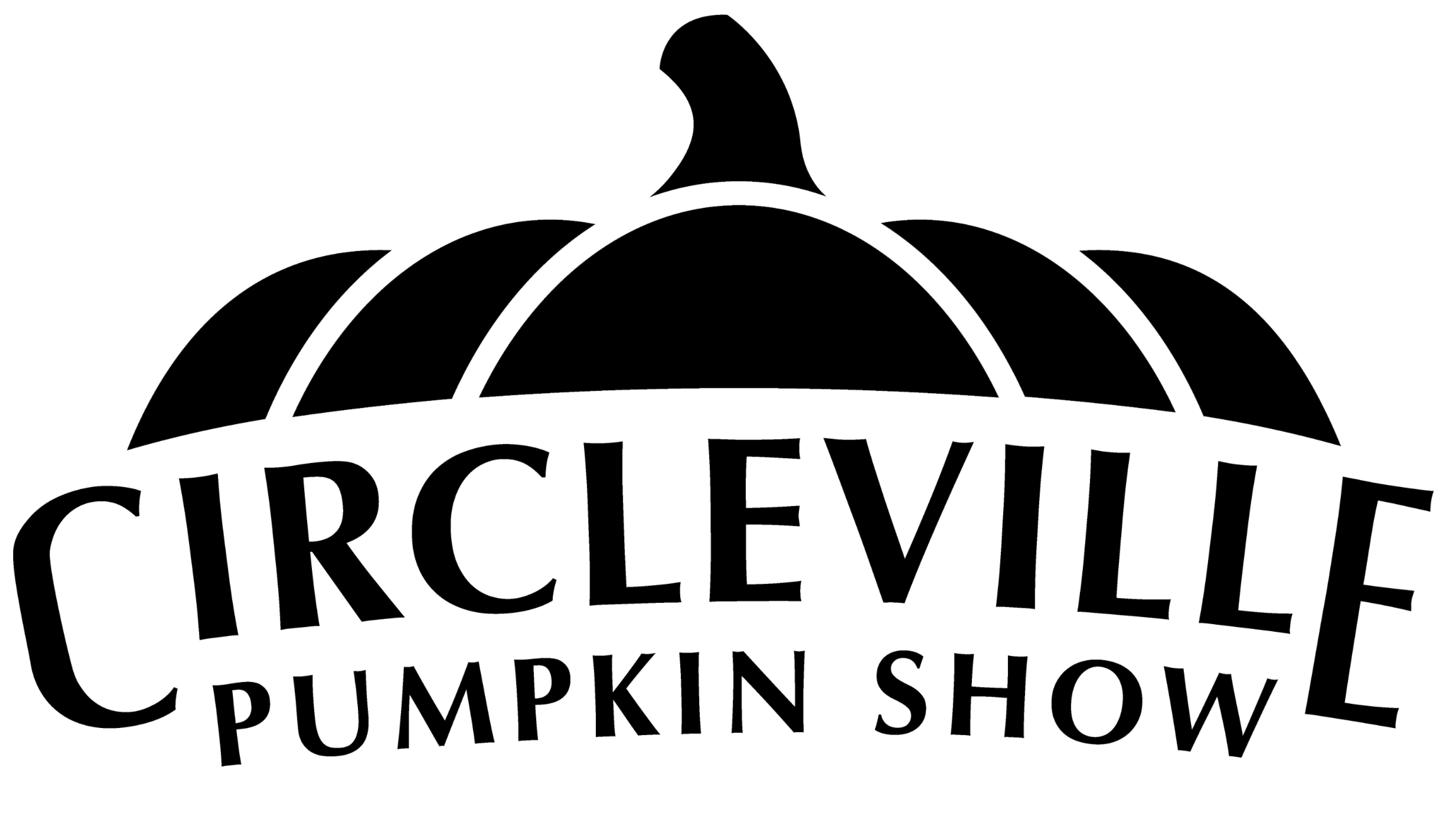
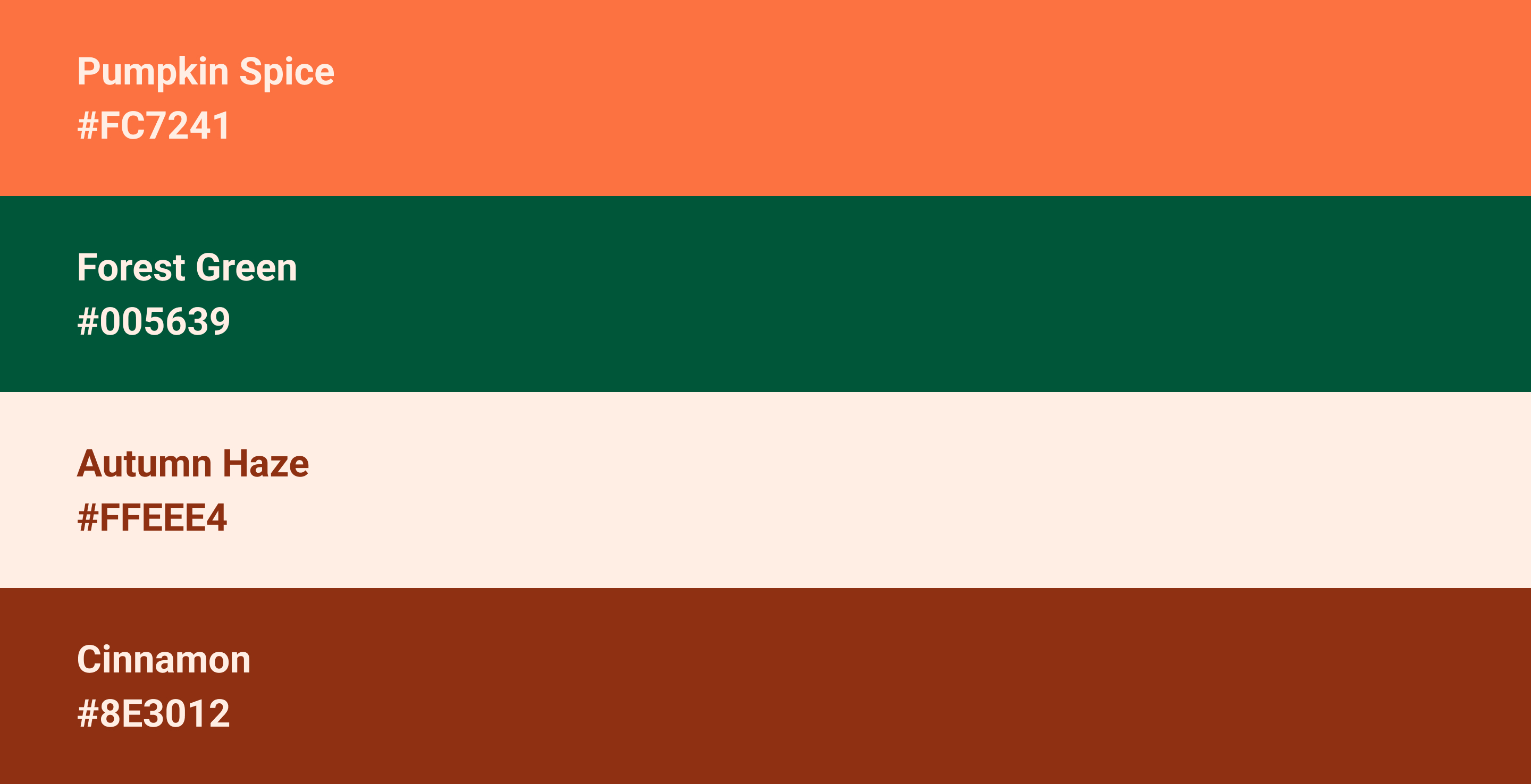
I picked colors and type that communicate tradition, celebration, and the beauty of fall, aligning with the essence of the Pumpkin Show.
